348 colour combinations from 1933, and why designers still use them
A Japanese painter published a dictionary of colour pairs almost a hundred years ago. It is still one of the most useful tools for choosing colours, for a website as much as for a kimono. Who Sanzo Wada was, how the combinations work, and a free tool to browse all of them.

Fabio Frisone
Design · · 7 min read
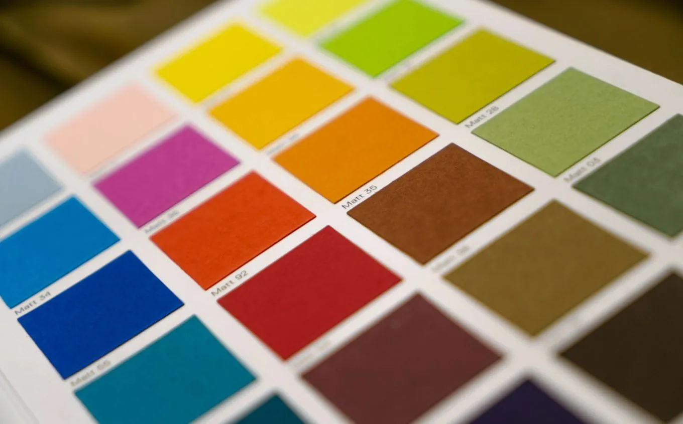
Most colour advice tells you about single colours: what blue means, what red does to appetite. That is the least useful way to think about colour. Nobody ever sees a colour on its own. A yellow next to navy is a different yellow from the same yellow next to pink, and the decision that makes a design work is never "which colour" but "which colours, together, in what amounts". Sanzo Wada understood that in 1933, and wrote a book that contains almost nothing else.
Who was Sanzo Wada
Wada was born in 1883 in Hyogo, in western Japan, studied painting at the Tokyo School of Fine Arts and spent 1907 to 1915 in Europe, mostly in France, on a government scholarship. Back in Japan he worked as a painter, a teacher and a designer of costumes and stage sets. In his seventies he won an Academy Award for the costume design of Gate of Hell, a 1953 colour film by Teinosuke Kinugasa. In between, he spent decades on colour itself: he was behind the Japan Standard Color Association, and in 1945 reorganised it into a colour research institute, which he chaired.
In 1933 and 1934 he published Haishoku Soukan, a six-volume collection of colour combinations. According to his biography, it was meant to capture the traditional Japanese way of seeing colour, at a time when Japanese design was absorbing everything from Europe and the US.
What is in the book
Seigensha, a publisher in Kyoto, reprinted the first part of the work as A Dictionary of Color Combinations, and that small square book is the version most designers know. It contains 348 combinations built from 159 colours. 120 combinations have two colours, 120 have three and 108 have four. Every colour has a number, a Japanese name, an English name and its exact CMYK values for print. A second volume, published later, adds 237 more combinations from Wada's later work, including 72 themed on the months of the Japanese year.
The names are half the pleasure. The Japanese ones are often pictures: 鴇色, the pink of the crested ibis; 鶯色, the olive of the bush warbler; 若草色, young grass. Many of the greys end in 鼠, mouse. The English names sound like a naturalist's catalogue, Vinaceous Tawny, Eupatorium Purple, Rainette Green, and several of them match the names in Robert Ridgway's 1912 colour standard, which shows how international colour already was in Wada's time.
- Coral Red 珊瑚珠色
- Benzol Green 青竹色
- Deep Lyons Blue 群青色
- Yellow 黄色
- Yellow Orange 柑子色
- Vandar Poel's Blue 縹色
- Sulphur Yellow 蒸栗色
- Grenadine Pink 洗朱
- Naples Yellow 淡黄蘗
- Deep Slate Green 鉄色
- Red Orange 朱色
- Dark Medici Blue 藍鼠
- Pale Lemon Yellow 淡卵色
- Isabella Color 落葉色
- Pyrite Yellow 淡青朽葉
- Peach Red 杏色
- Sea Green 若竹色
- Nile Blue 水色
Why combinations matter more than colours
Colour is relative. The same grey looks warm next to blue and cold next to orange; a saturated red can look elegant next to deep green and cheap next to purple. Josef Albers spent a whole book, Interaction of Color, proving that the eye almost never sees a colour as it physically is. That is why picking a brand colour on its own so often goes wrong: it looks right on the swatch and wrong on the page, because on the page it is never alone.
A good combination solves that problem in advance. Each of Wada's sets is a decision someone with a very good eye has already made: these two or three or four colours hold together, none of them drowns the others, and the whole has a mood. Some feel like spring textiles, some like a 1930s poster, some like a lacquer box. You are not starting from a colour wheel and a theory. You are starting from something that already works.
What people use it for
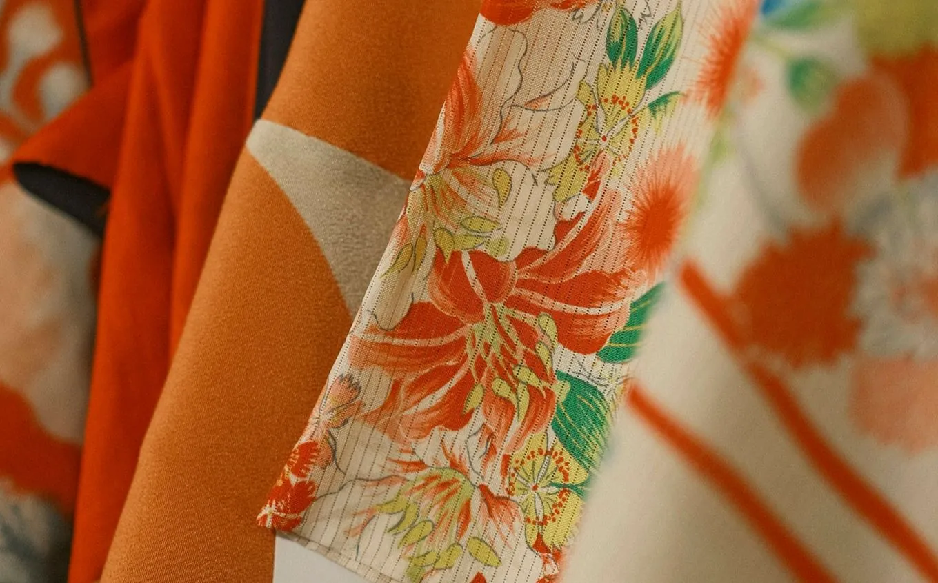
Illustrators use it to give a series of drawings one consistent mood. Brand and packaging designers use it to find a palette that does not look like every other startup; a combination from 1933 has the advantage that no software has made it a default. Interior and fashion designers use it the way Wada intended, for rooms and clothes. And for websites it is a fast way out of the problem we described in why AI-built websites all look the same: when a tool picks colours for you, it picks the average, and the average is purple.
Turning a combination into a website
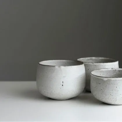
A website needs more from a palette than a poster does, because people have to read it. The simplest way to use a three-colour combination: the lightest colour becomes the background, the darkest becomes the text, and the third goes to buttons, links and small details. An old rule of thumb from interior design helps with the amounts: roughly 60% of the main colour, 30% of the second, 10% of the accent. Try it on a few of Wada's sets:
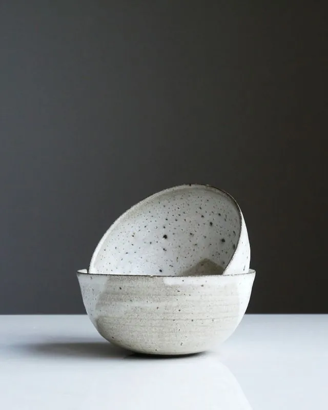
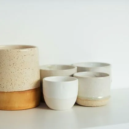 Morning cupsSet of four
 Rice bowlsSpeckled white
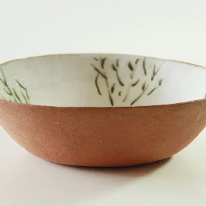 Grass bowlOne of a kind
The lightest colour is the background, the darkest the text, the third the colour blocks and buttons. The studio is invented. Photos: Tom Crew, Vladimir Gladkov and Viviane Okubo, Unsplash. Colours converted from the book's CMYK values, so approximate on screen.
Each of these passes for text, but not every combination in the book does. Wada designed for print, fabric and paint, not for screens or for the contrast rules we explained in the accessibility post, and some of his most beautiful pairs are two colours of almost the same darkness, lovely side by side and unreadable as text on background. Use his combinations for the mood, then check your text colour against your background. Often the fix is simple: keep the combination for large areas, blocks and accents, as the mock-up does, and set the text in a darker or lighter version of one of its colours.
One more practical point. The book's values are CMYK, made for ink on paper. On a screen they have to be converted, and the result is an approximation. If you also print, use the CMYK values for print and the converted ones on screen, and check both before you commit.
The tool we built
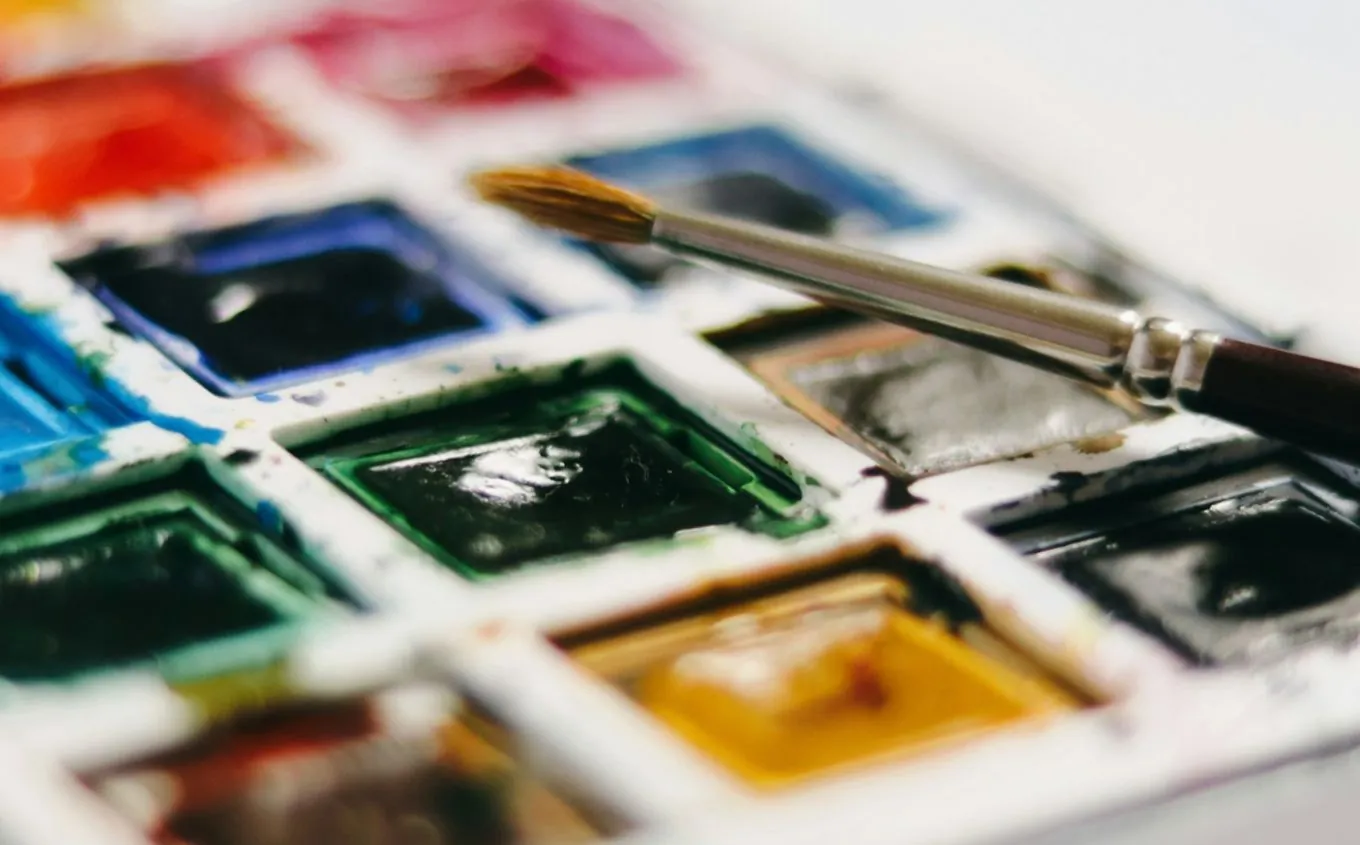
We use Wada's combinations often enough that we built our own browser for them, and it is free for anyone. It has all 348 combinations from the first volume, filterable by two, three or four colours, and searchable by English name, Japanese name or number. You can pick any colour, use the eyedropper or click on a photo you upload, and it finds the closest colours in the book and every combination they appear in. Click a swatch to copy its hex code.
If you end up using it a lot, buy the book. The printed colours are the real ones, and it is a lovely object to have on a desk.
Sources
- Wikipedia: Sanzo Wada
- Printed Matter: A Dictionary of Color Combinations Vol. 2, Seigensha
- Columbia University Libraries: Ridgway, Color Standards and Color Nomenclature (1912)
The combinations are Wada's; the numbers and names follow A Dictionary of Color Combinations (Seigensha). Screen colours are converted from the book's print values and are approximate.
Fabio Frisone
Websites, online shops and web apps at Frisun. Fabio builds your website, your shop or your web app, and makes sure it works for your business. He brings experience in finance, data analysis and e-commerce, so he looks at your site the way you do: how many people find it, and how many of them become customers. He builds from scratch with modern tools, and he is just as happy on Squarespace, Wix or Shopify if you would rather stay on a platform you know. About the studio