Why AI-built websites all look the same
A purple gradient, a centred headline that could belong to anyone, three cards with little icons. There is a specific reason every generated site looks like this, and a cheap way to not look like it.
Adí Aviram
Design · · 6 min read

A big centred headline that says "Transform the way you work". A purple-to-blue gradient behind it. Three cards with thin line icons. A row of testimonials from people with suspiciously good headshots. If you have looked at a few sites made with AI tools lately, you could draw this from memory. Try the switch below and watch the same business change character.
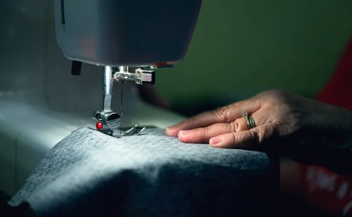
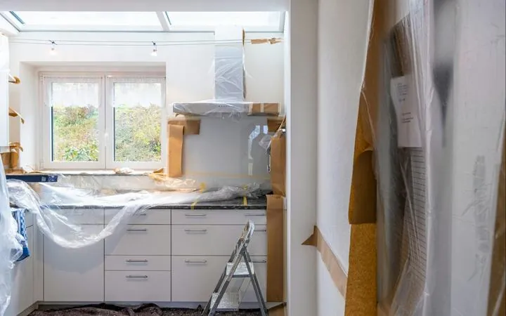
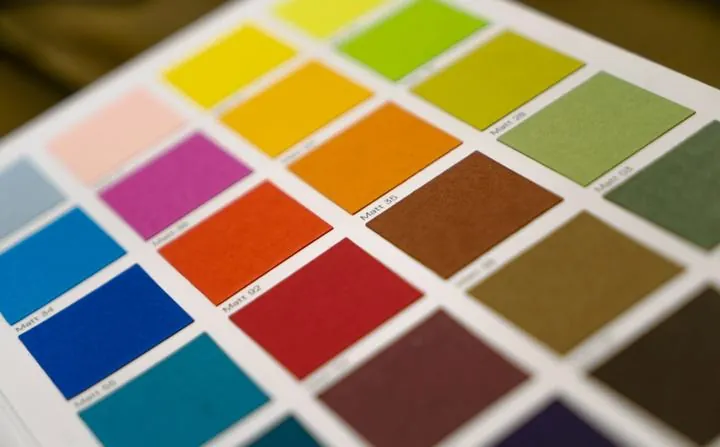
Two mock-ups drawn for this post. The tailor is invented. The patterns are not. Photo: Alexander Grey, Unsplash.
Where the purple comes from
The colour has a surprisingly specific origin. A developer traced it in a post called "Why Your AI Keeps Building the Same Purple Gradient Website". Tailwind, one of the most used CSS frameworks, shipped its demo components in a shade of indigo. Thousands of developers copied those demos into real sites. The sites ended up in the data that AI models learn from, and now the models reach for indigo whenever someone asks for "modern". His summary: the models are "not designers, they're statistical pattern matchers."
The same thing happens to every other decision on the page. Ask for a landing page without saying much, and the model fills each blank with the most common choice it has seen. The safest font. The most common layout. The words that appear on a million landing pages: elevate, seamless, unlock, empower. Each choice is defensible on its own. Together they produce a site that could belong to anyone.
Why it costs you
People decide how they feel about a page very fast. In 2006, a team at Carleton University led by Gitte Lindgaard flashed web pages at people for 50 milliseconds and asked them to rate the visual appeal. The ratings were already consistent at that speed. The paper is called "Attention web designers: You have 50 milliseconds to make a good first impression!", which may be the best title an academic paper about websites has ever had.
And appearance feeds straight into trust. A Stanford study for Consumer Reports' WebWatch project had 2,684 people judge the credibility of real websites. The thing they commented on most was not the company or the content. It was how the site looked: 46.1% of all comments. That was 2002. People have not become less judgemental since.
When a visitor has seen your exact hero section on twenty startup sites this year, it does not read as modern. It reads as "didn't bother".

The fix is mostly subtraction
We use AI tools for building, every day, and we have written about which ones do what. But when we prompt for design, the first thing we give the tool is a list of what not to do, and it is always roughly the same. No gradients. No emoji as section headings. No row of three feature cards. No "unlock" or "elevate". Nothing centred unless there is a reason. A little rocket next to "Our Mission" is the clearest sign that nobody looked at a page before it went live.
Why a studio still does it better
Before we design anything, we look at the business from the outside. What the brand already is, even if it is only a sign and a logo. What the competitors' sites look like, so this one does not look like them. Who is going to visit, and on what screen. Only then do we decide on colours, type and layout, and those decisions come from years of doing it: knowing which colour combinations hold up on a phone in sunlight (a colour dictionary from 1933 helps more than any generator), which trends will look dated next year, when a page needs to be calm and when it can be loud. On becure.org that meant putting a number where everyone else puts a logo.
AI is part of that work. It writes first drafts of code, produces variations in minutes and saves us hours of routine. But it does what it is told, and it does not know what to tell itself. Ask it for "a beautiful website" and you get the average of every website it has seen. Like any tool, it is as good as the person holding it.
So anyone can make a basic website with AI today, and for some jobs that is enough. What you get from a studio is everything the tool does not have: the experience of design and visual communication that tells you what to ask for, what to throw away, and what makes a stranger remember your business instead of the twenty sites that look like it.
Adí Aviram
Design, illustration and SEO at Frisun. Adí is a creative developer, designer and illustrator. She builds websites that tell a story: scrollytelling, data visualization, interactive maps and illustration. She has worked on projects with +972 Magazine, Göttingen University and the Goethe Institute. Adí brings the colour, the motion and the character to every site you get from Frisun. About the studio